Research
Define
Ideate
Prototype
Conclusion


Problem
________
During the development of the KazooBadoo game app, the client required a complementary website to effectively introduce and facilitate the download of the app.
Solution
________
Updated website with improved, streamlined navigation, and effective CTAs. The website needed also incorporate consistent branding and support user sign-ups and downloads.
My Role
________
UX, UI, Branding, Avatar design
Scope
________
240 hours Client project
OVERVIEW
OVERVIEW
OVERVIEW

The goal was to redesign the website to enhance user engagement, improve navigation and usability, and ensure alignment with the app’s branding. The redesign focuses on creating an engaging, visually appealing, and user-friendly experience that resonates with both kids and their parents.


Before & After

After the UX team and I presented the initial design of the website to stakeholders and potential users, we found out that there are areas to make improvement.

Lack of Engagement:The current website fails to capture the interest of potential users due to an outdated design and lack of interactive elements. It does not effectively communicate the app's unique features or benefits, resulting in lower-than-expected engagement and download rates.

Ineffective Presentation:The website does not present the app's key features and gameplay clearly. Potential users are not provided with compelling visuals or descriptions that would entice them to download the app.

Poor Navigation and Usability:Users experience difficulty navigating the website, which impacts their ability to easily find information about the app and download it. The current layout is not intuitive and does not guide users effectively through the site.

Inconsistent Branding:There is a mismatch between the website’s design and the app’s branding, causing a disjointed user experience. This inconsistency undermines the app’s overall brand identity and user recognition.

UI Improvement Issues:

Outdated Interface:
The game app’s UI is perceived as outdated and does not meet current design standards. This impacts user satisfaction and engagement, as modern users expect a more polished and visually appealing interface.

Usability Challenges:
The app’s navigation and controls are not as intuitive as they could be, leading to a steeper learning curve for new users. The UI design does not effectively support the app’s functionality, resulting in user frustration and potential drop-offs.

Inconsistent Visual Design:
There is a lack of consistency in visual elements, such as color schemes, fonts, and button styles, which affects the app’s overall aesthetic appeal and usability.

Competitive Analysis

I've worked on a competitive analysis by comparing sites that my users would visit, both direct and indirect competitors. For direct competitors, I included the sites that the uses would like to currently purchase their clothes. Plus, I included sites that offer new technology in fashion as indirect competitors.

The direct competitors offered size charts and a virtual stylish which you can schedule with during weekdays. However, it didn’t offer flexible hours for users but their stylists’ schedules. The indirect competitors offered new technology such as virtual try on and coordinating new style.

Research

I conducted a research to find out what are the main pain points and to understand what works for the users. I sent out 9 survey responses and had three interviews.

Competitors Analysis

In researching competitors’ homepages for showcasing game apps, several design strategies emerged as effective in capturing user attention and enhancing usability. The key takeaways include:
1. Prominent and Consistent Call-to-Action (CTA):Visibility and Clarity: Competitors frequently use prominent and consistently placed CTAs to draw attention and guide users towards key actions, such as downloading the game or signing up. This approach not only grabs users' attention but also contributes to a clean, uncluttered design.
2. Centralized Logo and Streamlined Navigation:Logo Placement: Positioning the logo centrally on the homepage enhances brand visibility and recognition. Additionally, separating the navigation menu from the logo area improves the overall layout, making the site easier to navigate and ensuring that users can quickly access different sections of the page.
3. Prominent Sign-Up Buttons:High Visibility: Competitors often place sign-up buttons prominently at the top of the page. These buttons are designed to stand out, making it easy for users to register or start engaging with the app right away.
These design elements, when effectively implemented, contribute to a compelling and user-friendly homepage that enhances user engagement and drives app downloads.
4.High Visibility:Competitors often place sign-up buttons prominently at the top of the page. These buttons are designed to stand out, making it easy for users to register or start engaging with the app right away.These design elements, when effectively implemented, contribute to a compelling and user-friendly homepage that enhances user engagement and drives app downloads.

Wireframes–Low Fidelity

Base on my research, I jot down the major features or UI design that I made improvement. And I sketched out key screens that can be enhanced.

1. Adding icons before a long paragraph will help users to be engaged with the content.
2. I found out that the users expected to see “register” button at the top and be prominent.
3. Using avatars will align with the branding and feel more friendly towards younger audience.
4. Having diversity of avatars help bringing different users to the site.
5. Having negative space between different sections will help making the design clean.

UI Design

Bright and Cheerful: Use a vibrant color scheme that’s engaging but not overwhelming. Colors should be consistent with the app’s branding.

Typography: Chose fonts that are fun yet legible, with larger sizes for headings and important information.

Kid-Friendly Graphics: Incorporated illustrations and images of characters from the app, educational elements, and playful designs that appeal to the target age group.

Logo

Typography

Color Palette

Conclusion


Testers completed three tasks: Task 1: Change Description 2: Share Return (QR) code 3: Amazon Pick-up

01
01
01

9/10 users said, overall it was very easy and straight forward

02
02
02

3/10 testers mentioned that the new icons that's been added looked familiar and went well with the current design

03
03
03

2/10 people mentioned that they first clicked the profile icon on the homepage

04
04
04

There was a suggestion that it would be nice to have the back button at the top. However, it's not following the current navigation that Amazon is using.

Prototype

What did I learn?

Overall, the redesign process was a valuable learning experience, emphasizing the importance of creating user-centered designs that cater to the specific needs of both primary and secondary users.

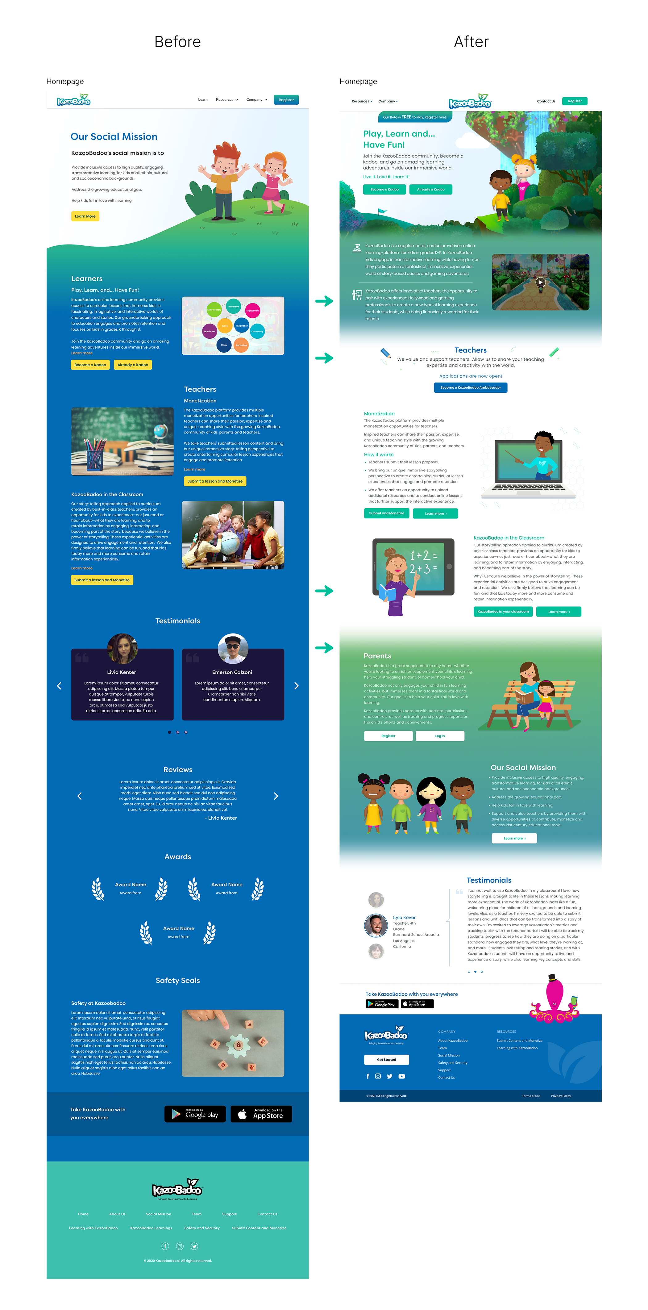
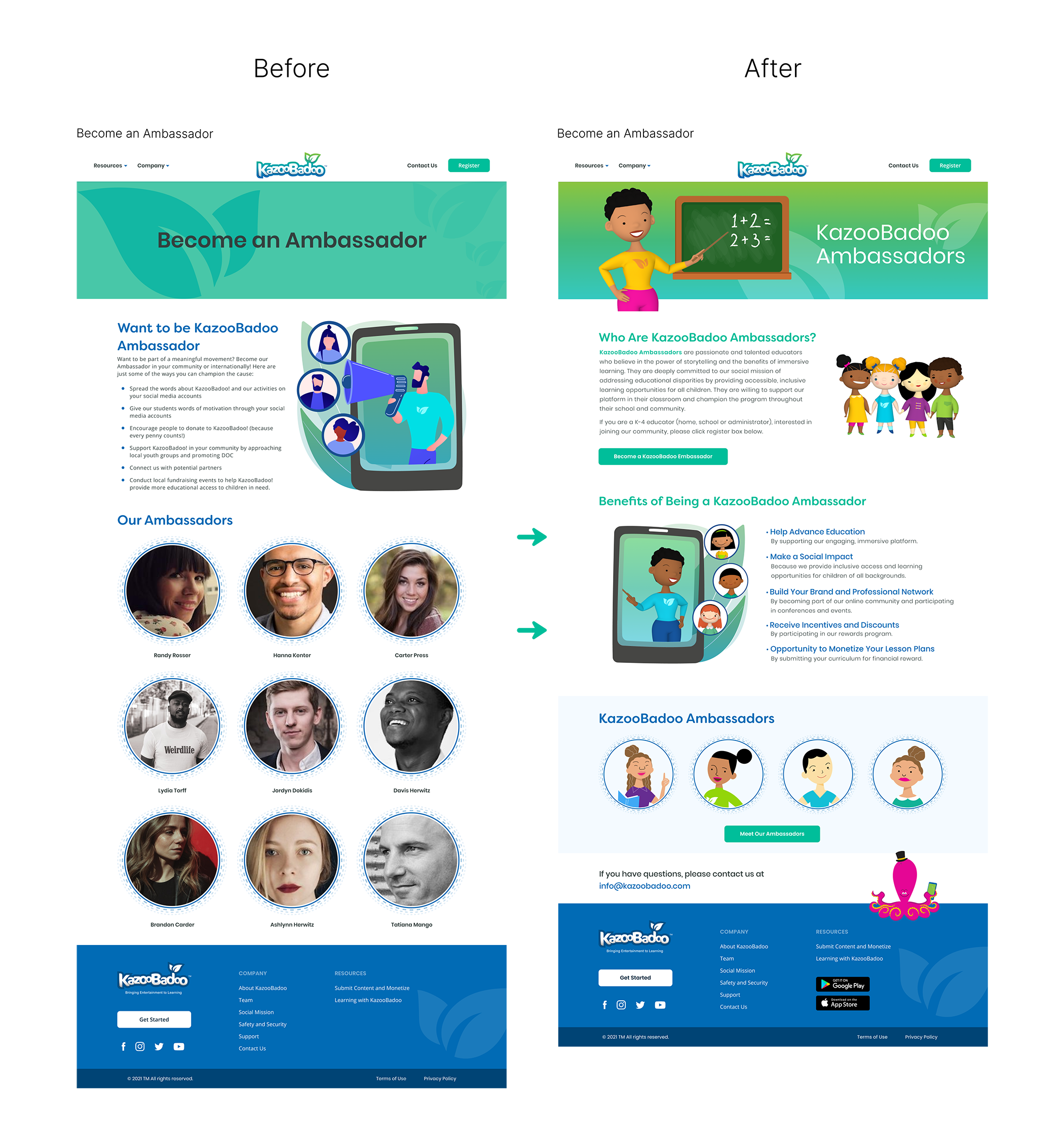
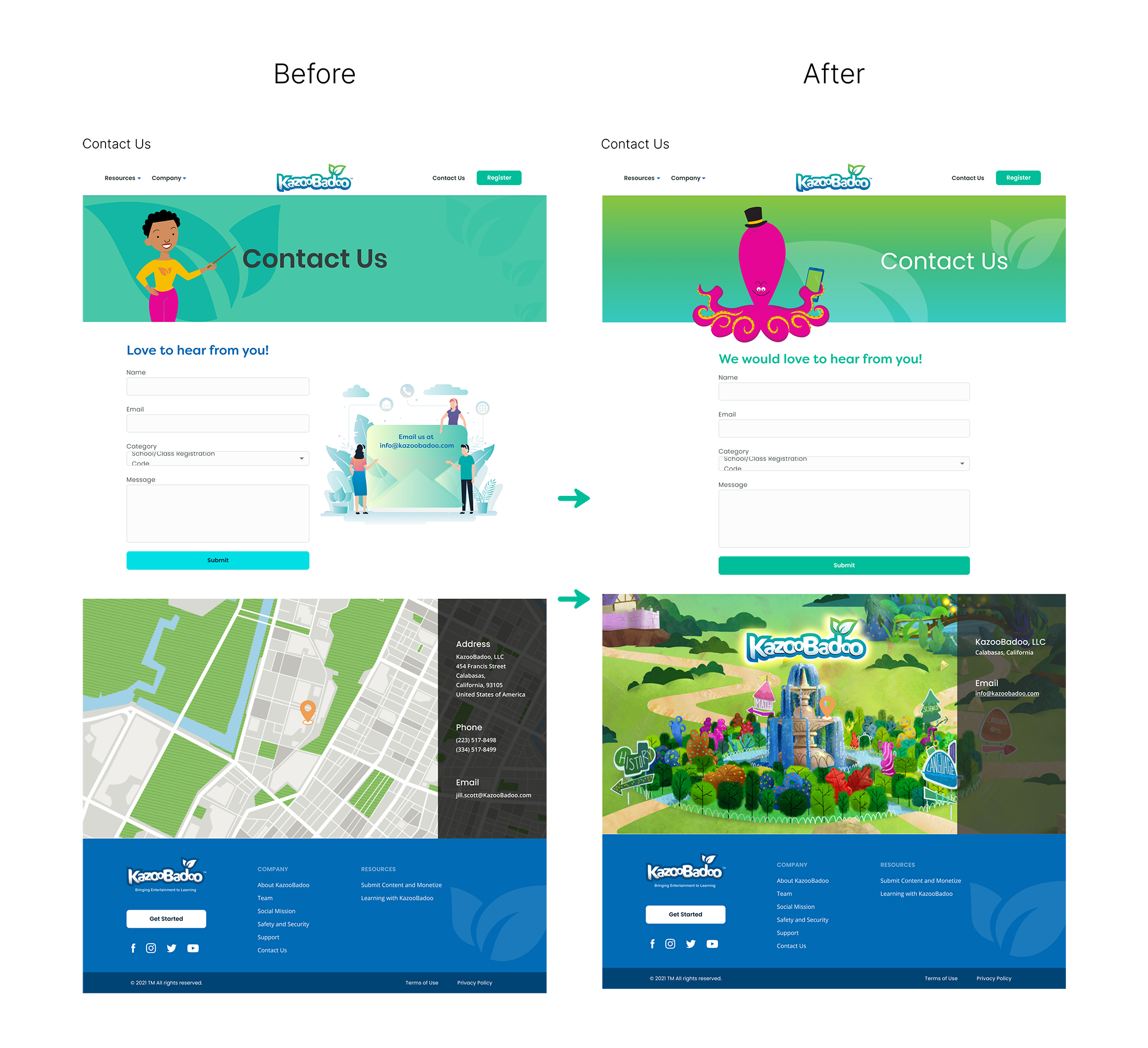
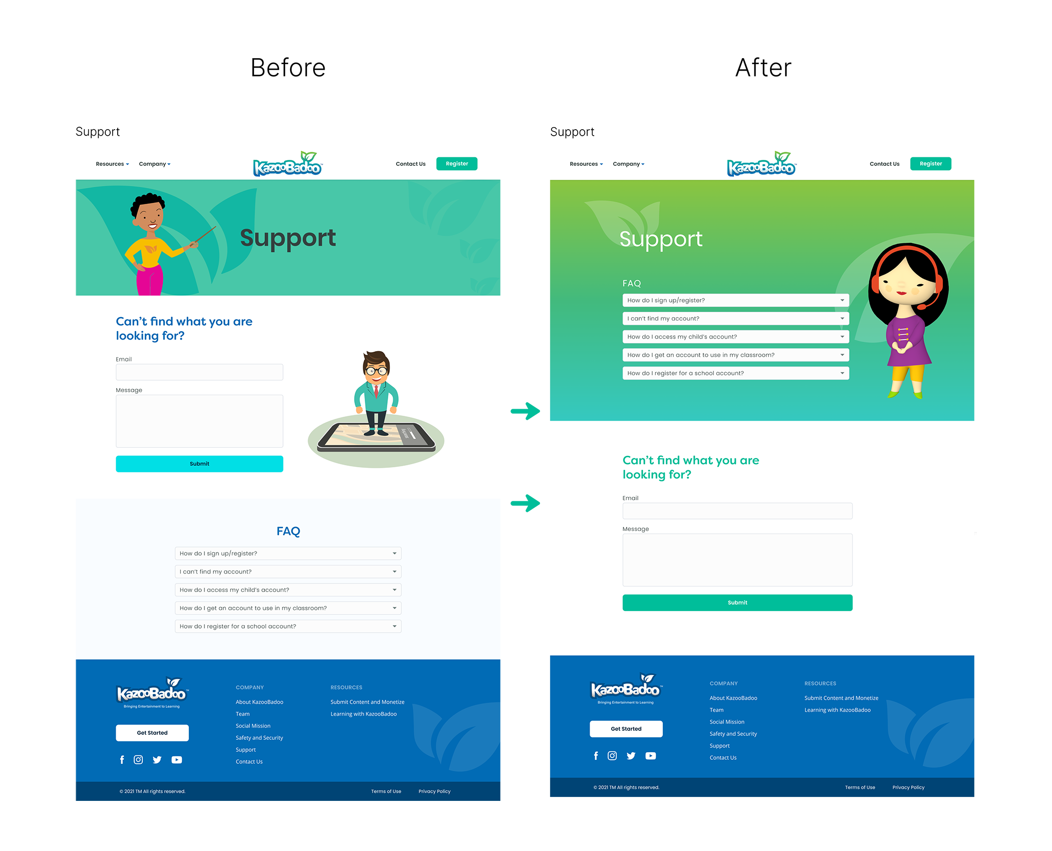
The redesigned website successfully balanced the needs of both children and parents. The engaging visuals and interactive elements captivated young users, while the clear, detailed information and reassuring content addressed parental concerns. The iterative design process and user feedback were instrumental in refining the site and ensuring it met the project's goals.

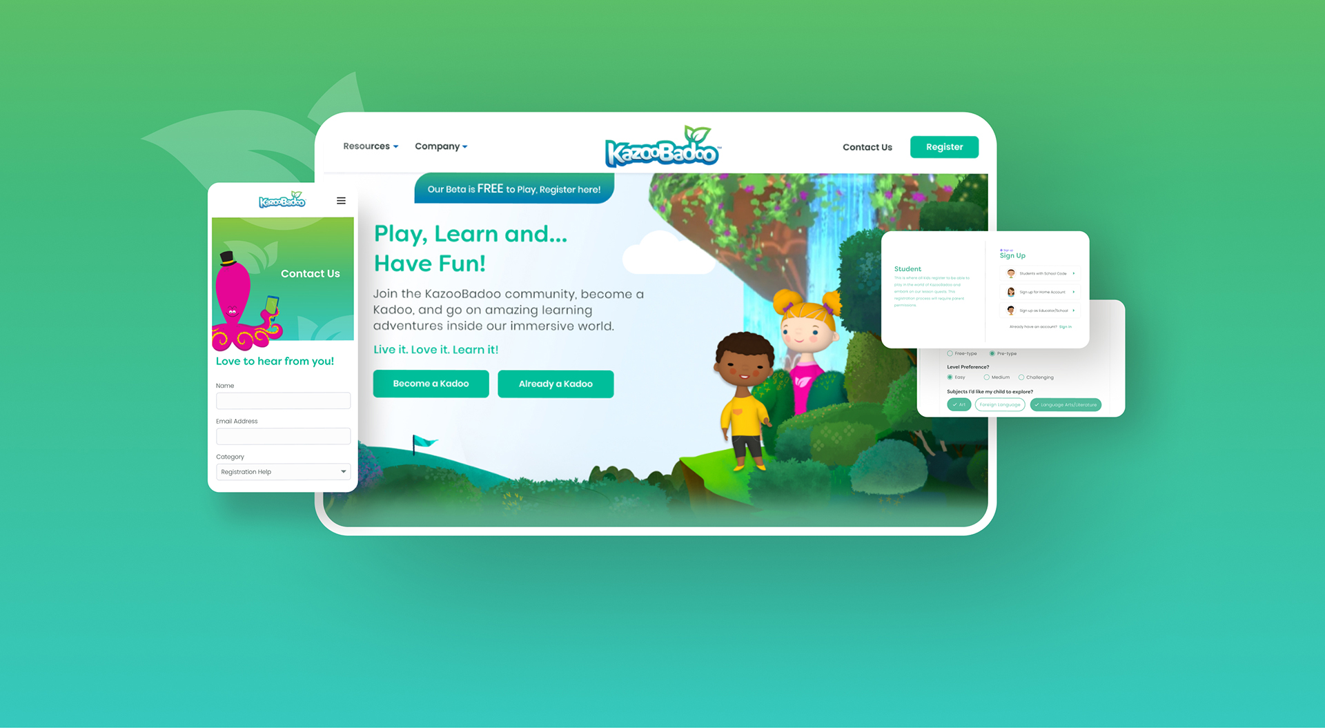
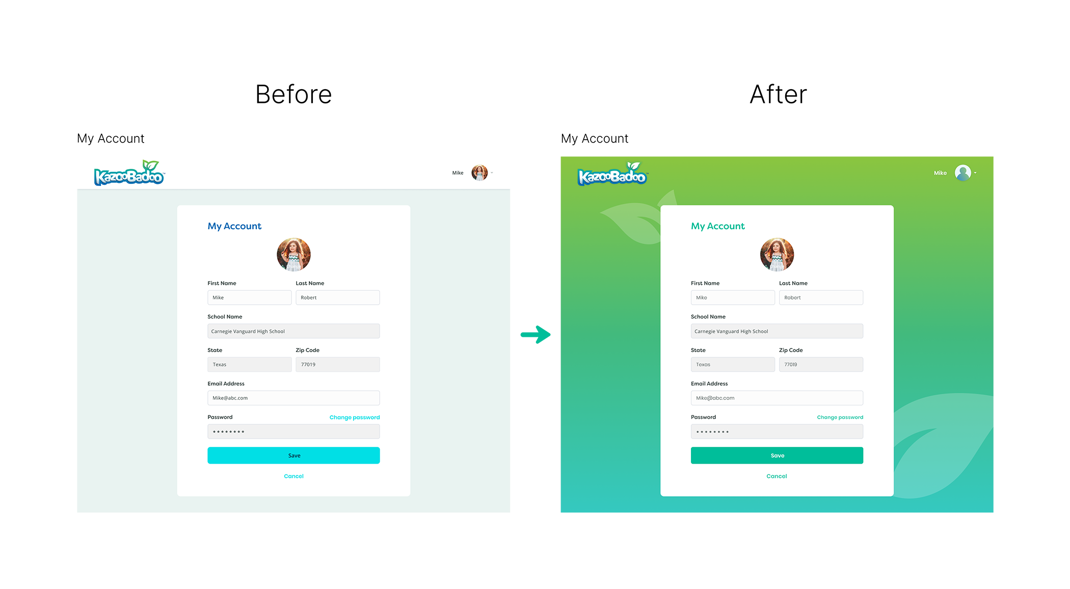
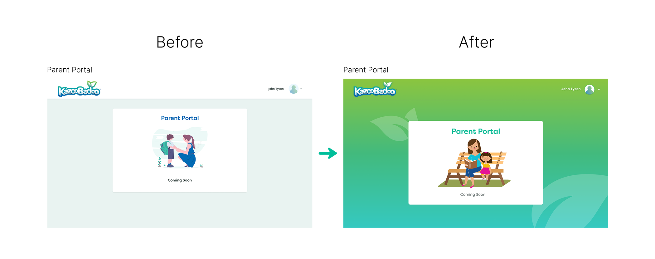
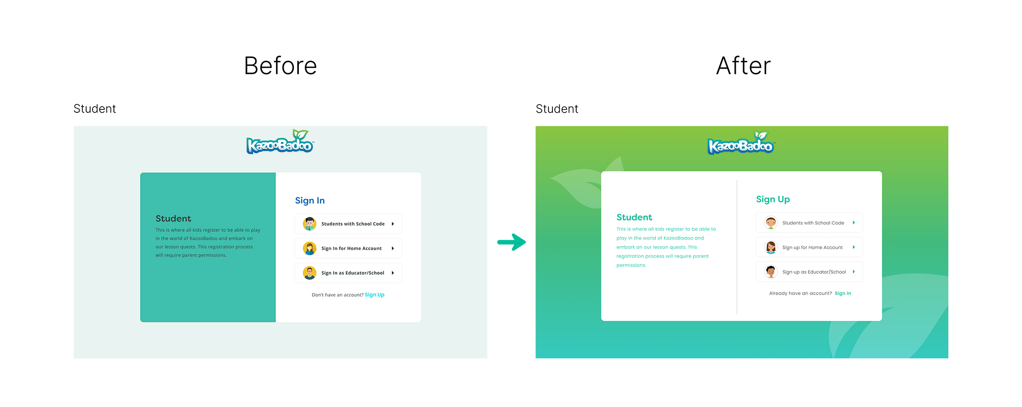
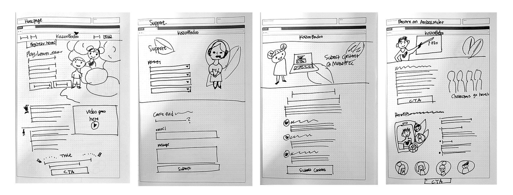
Responsive Design Considerations: Considering that users would access the site on various devices, I ensured the design was fully responsive. Testing on different screen sizes and devices helped guarantee that the website provided a seamless experience, whether on a desktop, tablet, or smartphone.

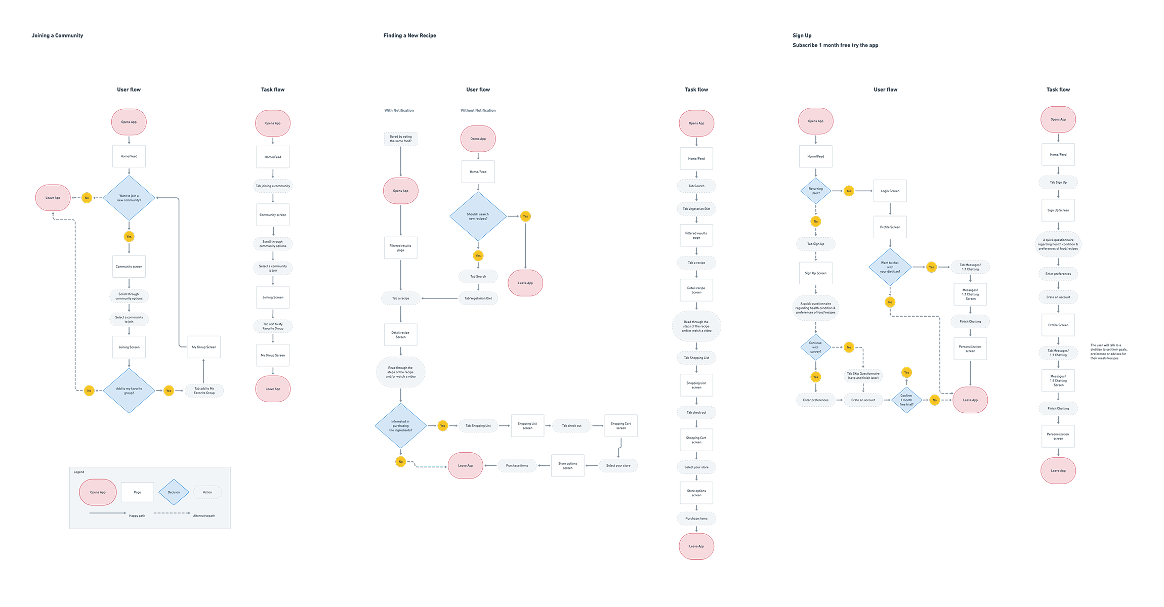
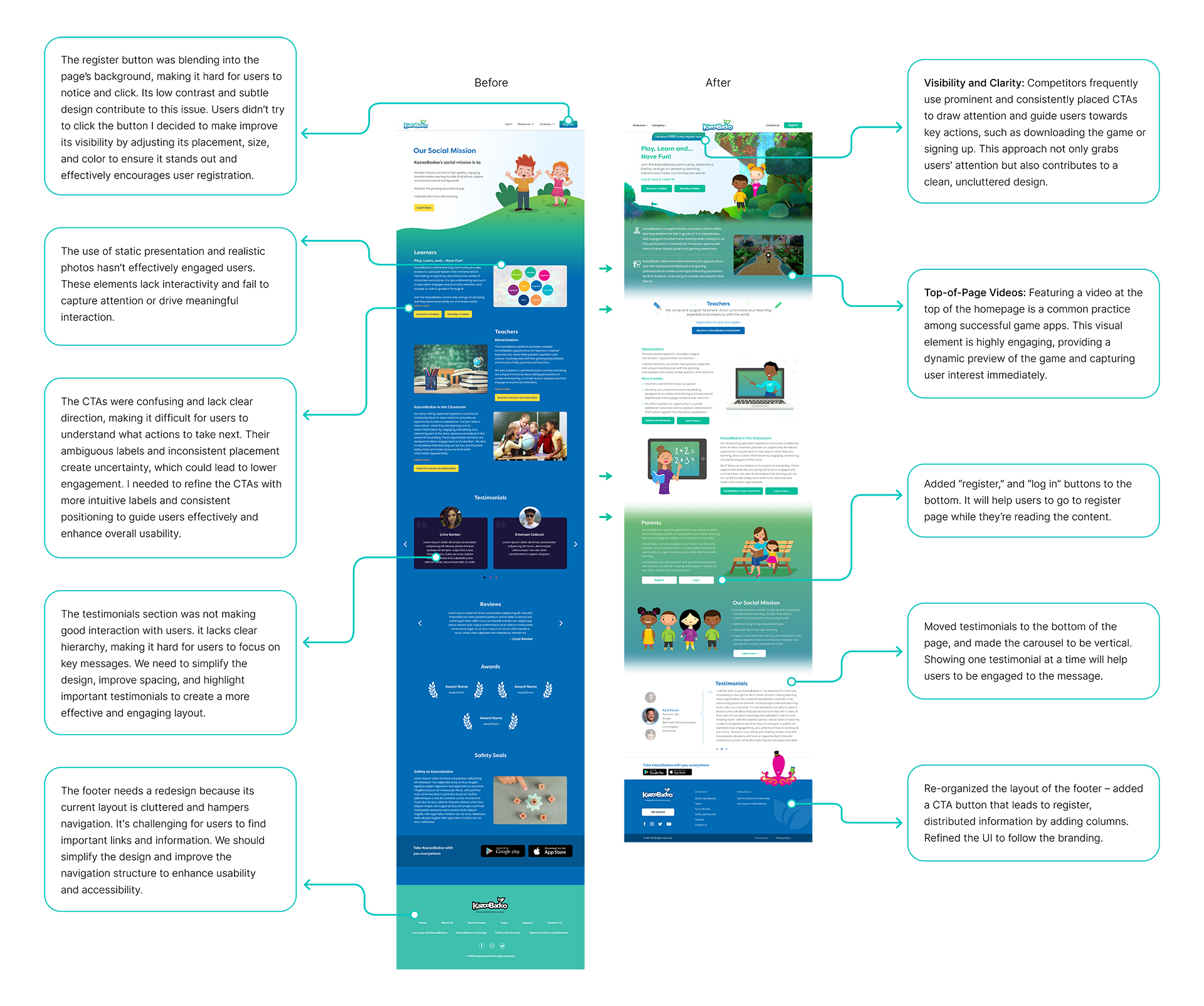
Testing and Iteration: User testing played a crucial role in refining the design. Feedback from children and parents highlighted areas for improvement, such as simplifying certain interactions and making key information more prominent. Iterative design allowed me to make data-driven adjustments and enhance the overall user experience.

Next Steps

Cross-Browser Testing: Test the website across different browsers and devices to ensure compatibility and a consistent user experience.

• Iterate and Update: Keep making iterative improvements to the website. This may include updating content, adding new features, or refining the user experience.

• Project Evaluation: Conduct a post-launch review to evaluate the success of the redesign, identify lessons learned, and document best practices.