People usually make an effort and time to find lost items. Unfortunately, it could take longer until you are reunited with your lost items.


People usually make an effort and time to find lost items. Unfortunately, it could take longer until you are reunited with your lost items.
Build a reliable and secure AI app that is actively searching the lost items to be reunited with their owners sooner and easier. It will navigate the object where they search and they can contact the person who finds it. In case of not finding them, members will still have benefits; receive partial credits through the memberships and/or will have a choice to purchase the lost items when someone finds it.
The below are gathered data: market research & trends to understand learning how we resolve the current issues now.


- In the US alone, over 400 million items are lost and found every year.
- The most commonly lost items include wallets, keys, phones, and umbrellas.
- The estimated value of lost items in the US is over $5 billion per year.
- It takes an average of five days for a lost item to be turned in to a lost and found service.
- The lost and found market is expected to grow by 7% annually.
- The global lost and found market is worth over $7 billion.
- North America is the largest market for lost and found services.
- The Asia-Pacific region is expected to have the highest growth rate for lost
and found services.
- The transportation sector is the largest consumer of lost and found services.
- Lostings (2023, May, 7) Lost and Found Statistics, Trends & Facts 2023
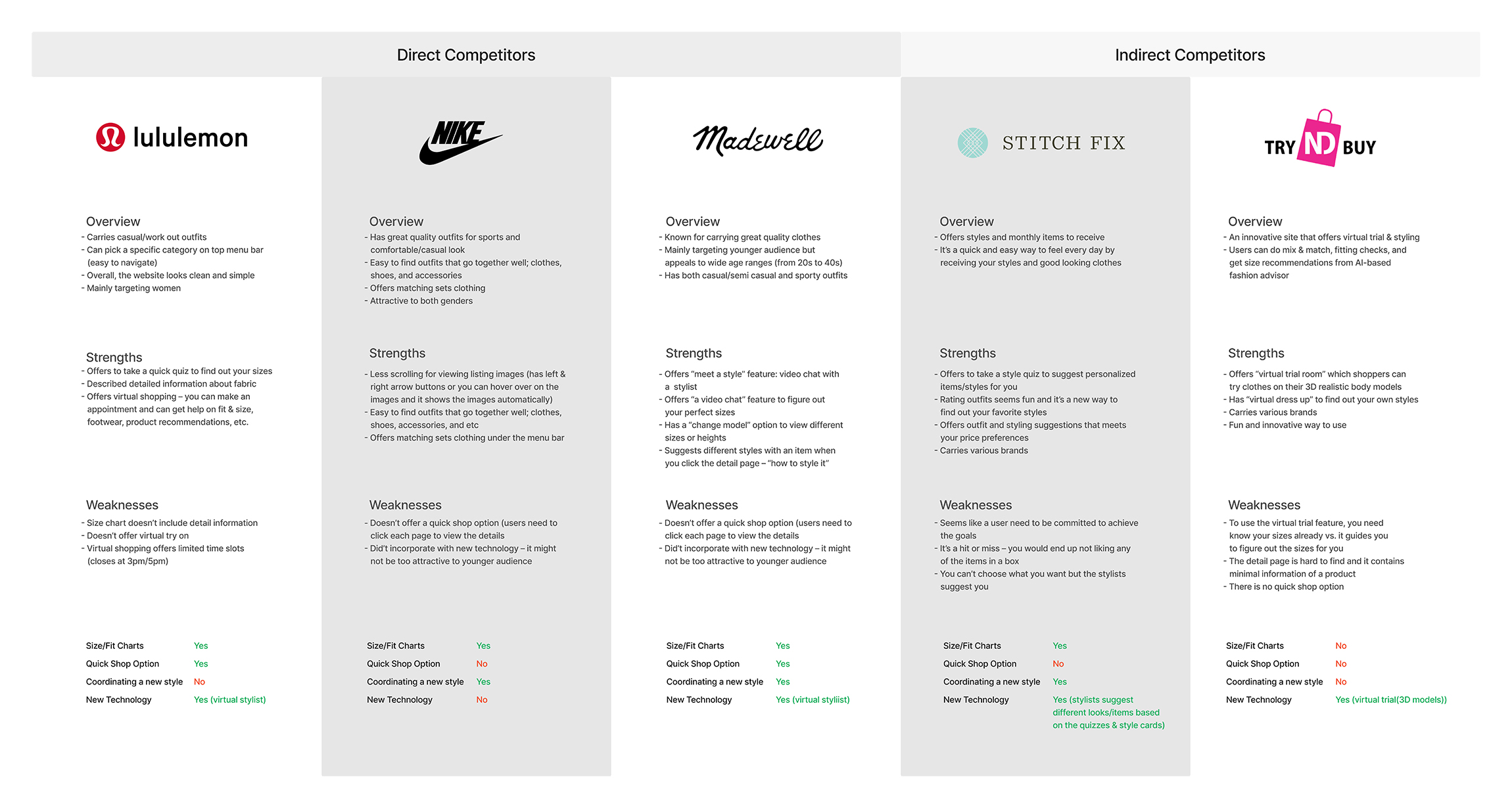
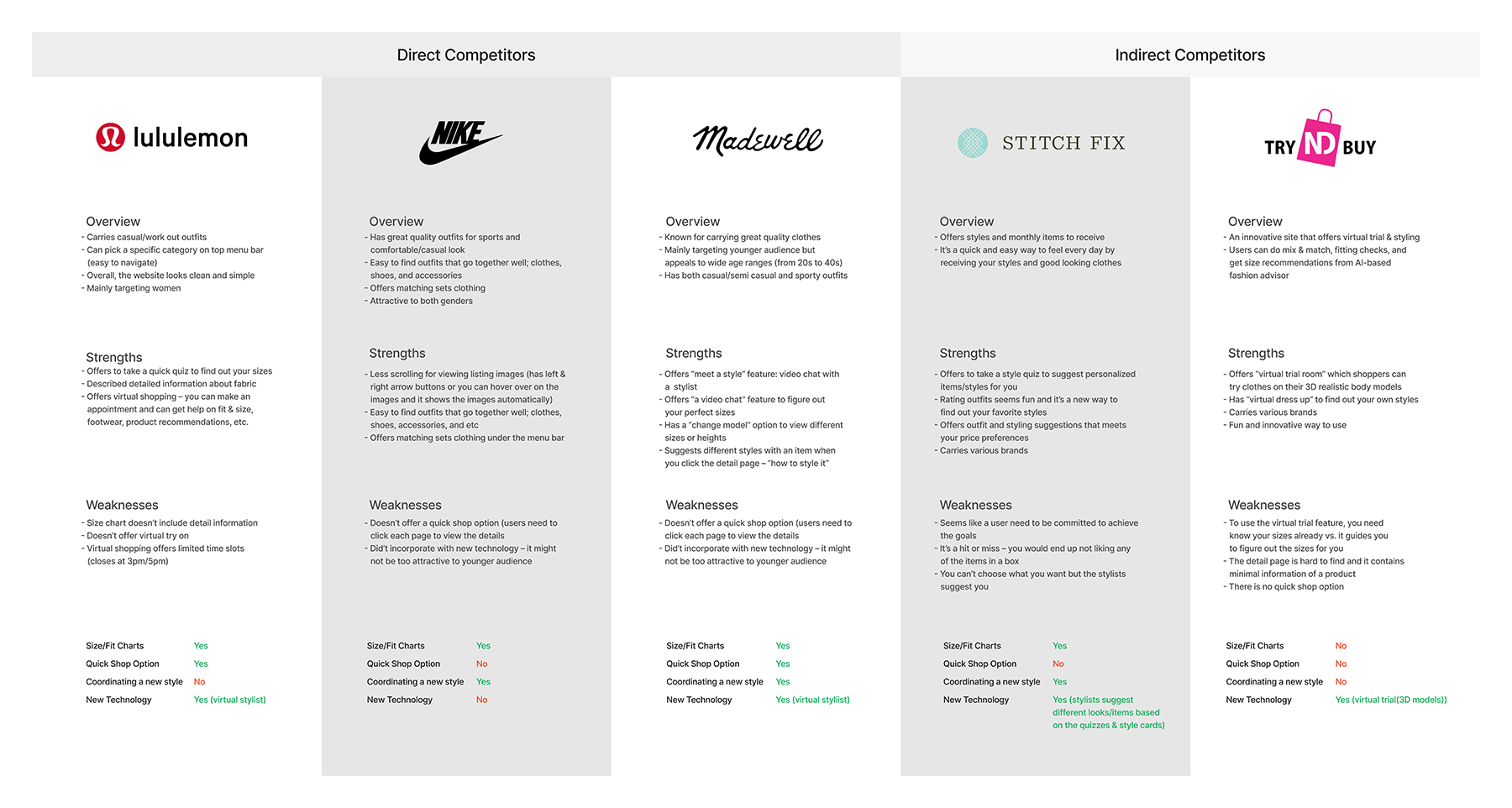
I've worked on a competitive analysis by comparing sites that my users would visit, both direct and indirect competitors. For direct competitors, I included the sites that the uses would like to currently purchase their clothes. Plus, I included sites that offer new technology in fashion as indirect competitors.
The direct competitors offered size charts and a virtual stylish which you can schedule with during weekdays. However, it didn’t offer flexible hours for users but their stylists’ schedules. The indirect competitors offered new technology such as virtual try on and coordinating new style.
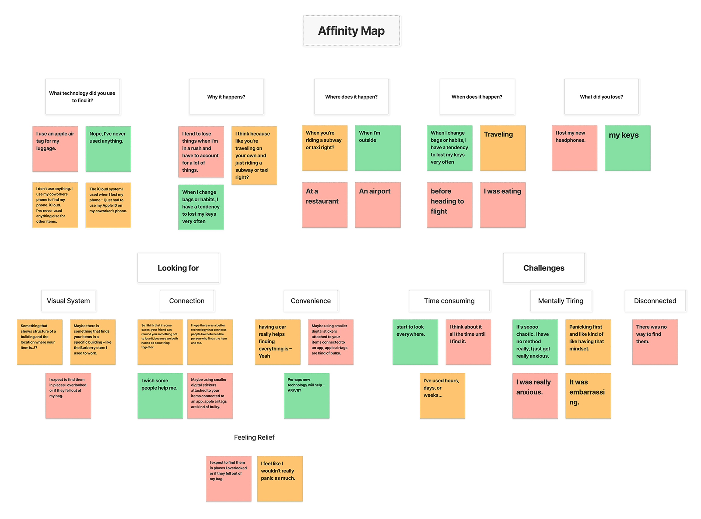
• Users complained about being mentally tiring when they were finding an item for days
or weeks.
• They wished that belongings to be united sooner than later.
• All users lost their items at a public place.
• All users never used any digital products for finding personal items besides phones
or luggages.

• Users felt disconnected when there was no one who helped them out.

• Users want to see visual/navigation system while they're looking for an item – this will help making them to feel relief as they know where the items are at.
• Users complained about being mentally tiring when they were finding an item for days or weeks.
• They wished that belongings to be united sooner than later.
• All users lost their items at a public place.
• All users never used any digital products for finding personal items besides phones or luggages.
Based on the research and interviews, users can be mentally tired while they’re looking for their items. They will loose time to enjoy other activities and/or cannot focus on work with a busy schedule.
The new product will help these users to have productive and stress-free day. Especially, a business person will enjoy on his/her trips as it will reduce the stress and time to find their lost items.
1. I’d like to explore ways to help people to find their personal items at public places quickly and efficiently, because they feel anxious and cannot enjoy other activities while they're looking for the items.
2. I’d like to explore ways to help an individual who lose his/her items when the person is having tight budgets, because people end up purchasing the same items after they try to look for them.
1. How might we support users to be united with their lost items sooner than later?
2. How might we have users to feel relief and enjoy other activities while they're looking for loose an item?
3. How might we help users spend less budgets on their lost items?
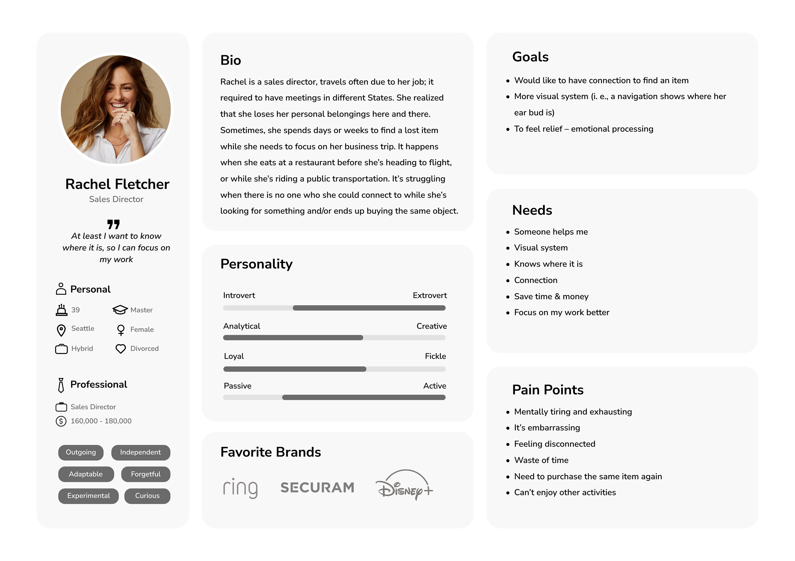
The persona I created is a business woman who travels often, she is independent and responsible. As she works hard and focuses on her career, she can be clumsy on keeping her items in a public. This persona helps understanding the users, and envision the next steps to aid my subject matter and hypothesis.

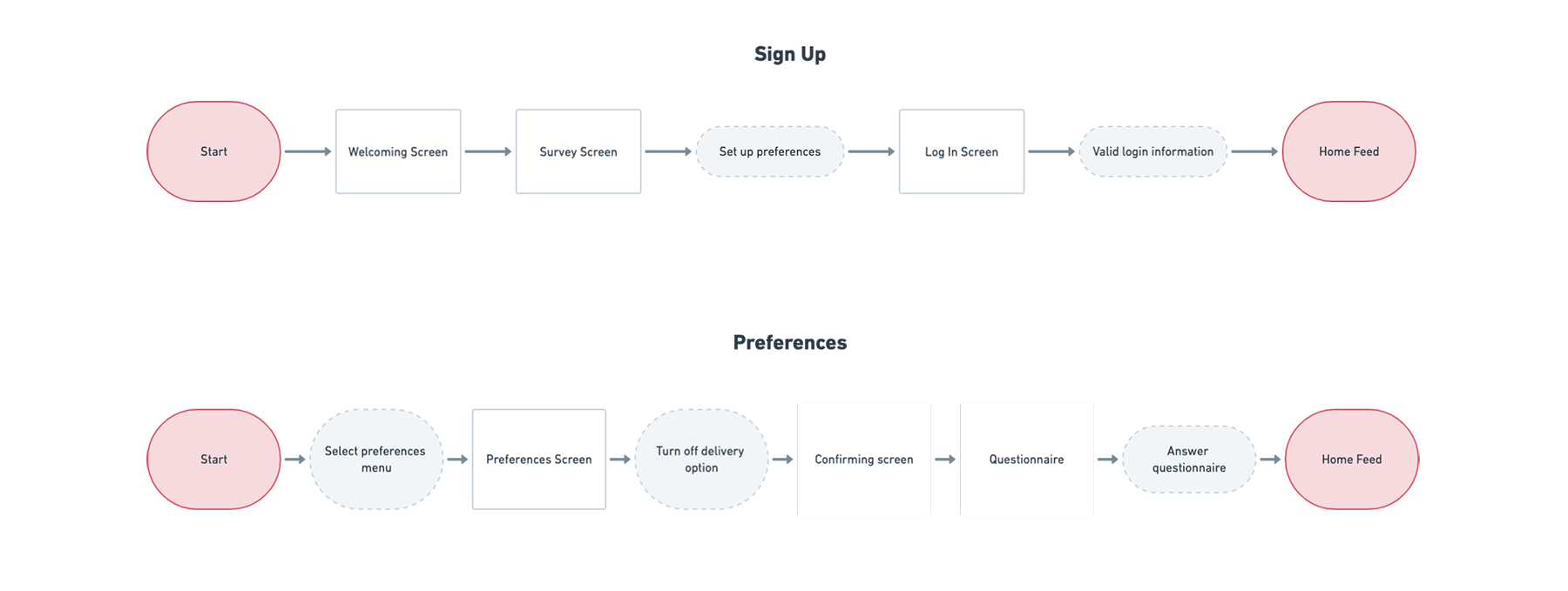
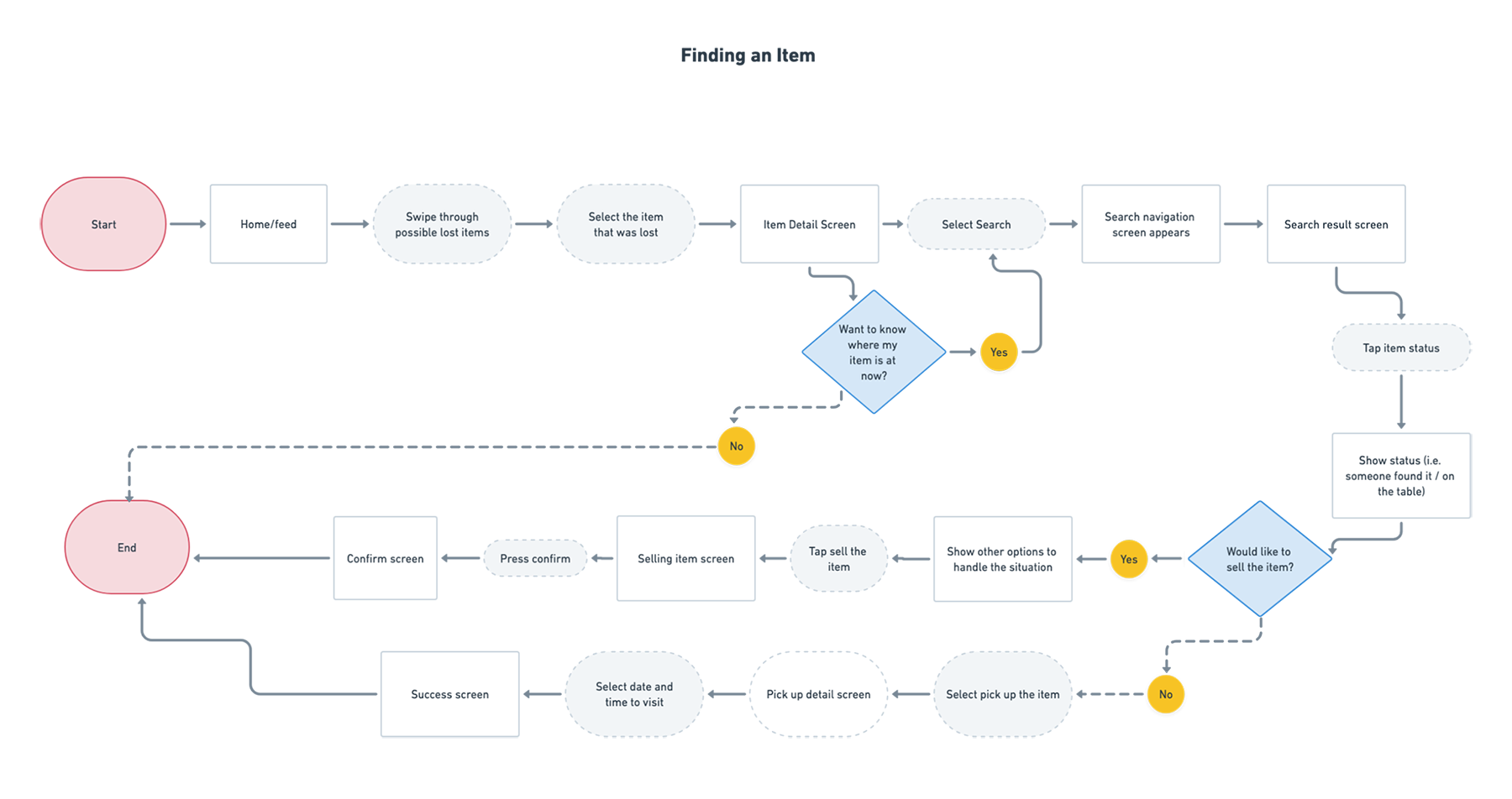
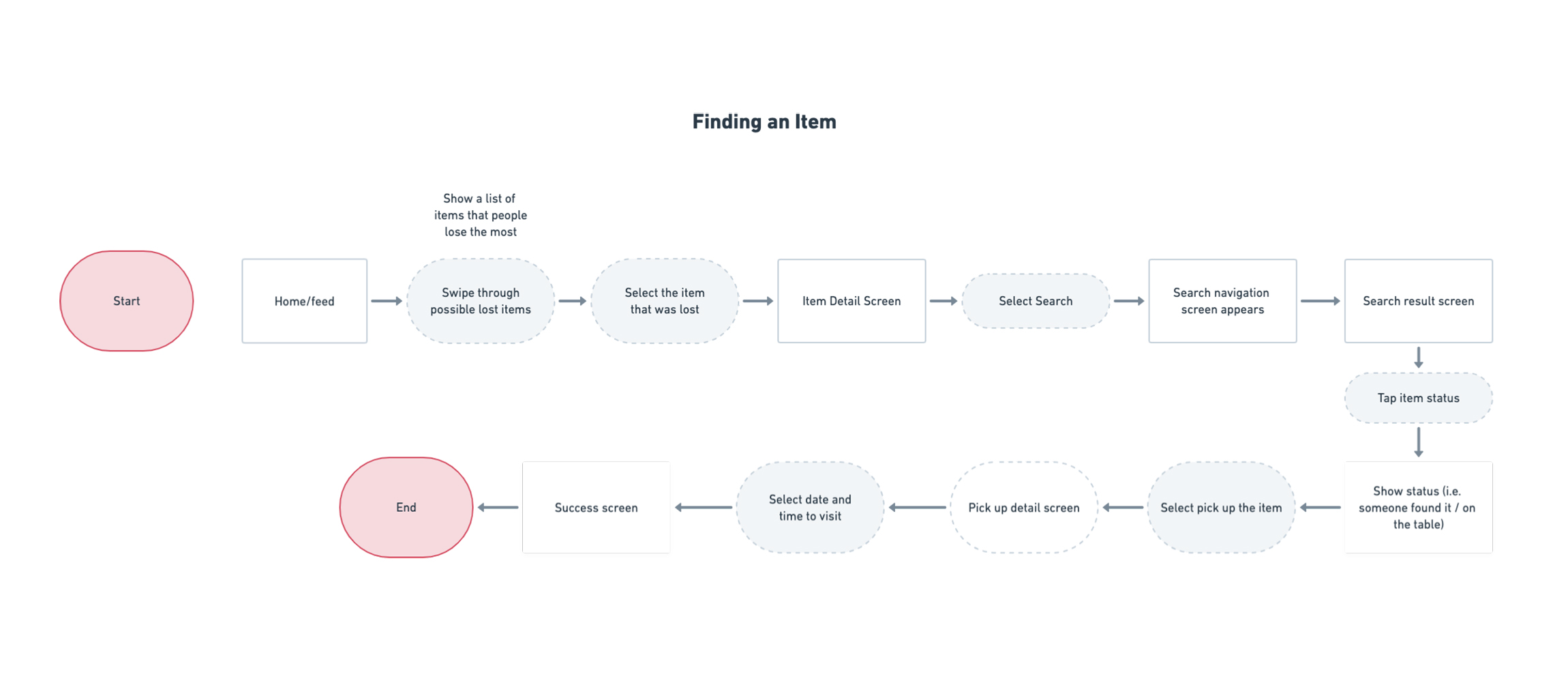
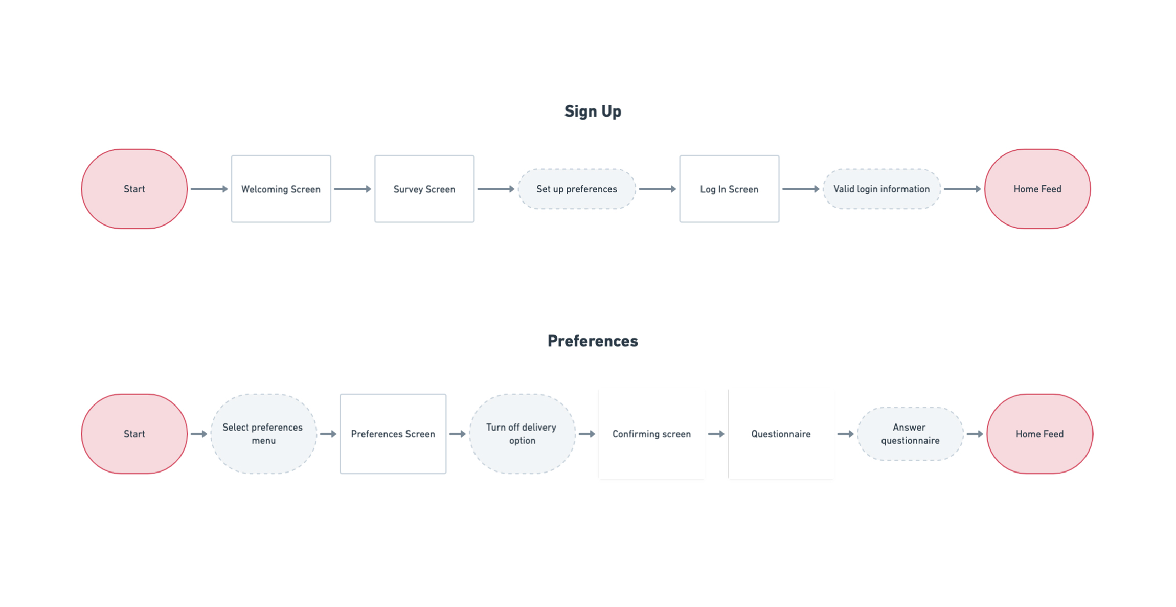
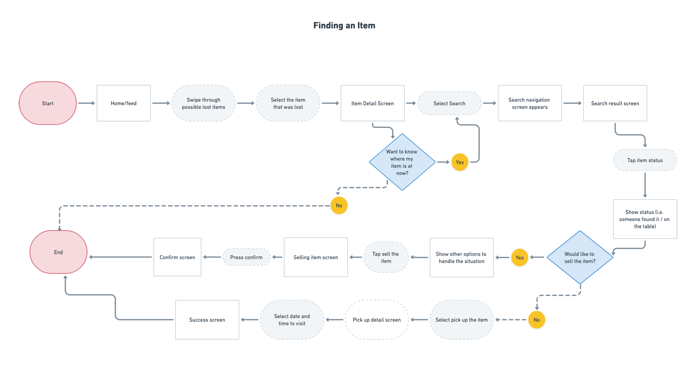
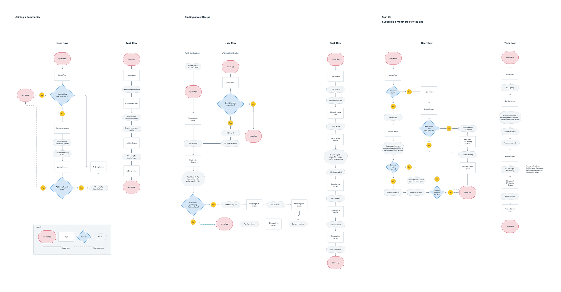
Creating main flow charts will show how users will experience the new digital product. These are hypothesis examples to learn how the product is effectively improve their situations. There're three task flows: Task 1: Finding an Item, Task 2: Sign-up, and 3: Preference. Then I focused on the flow "Finding an Item" and moved forward to create the user flow of it.
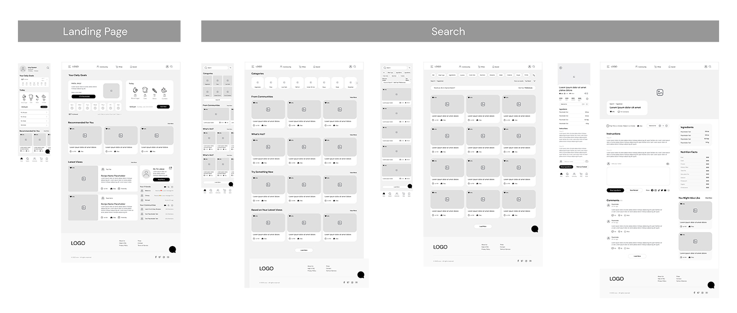
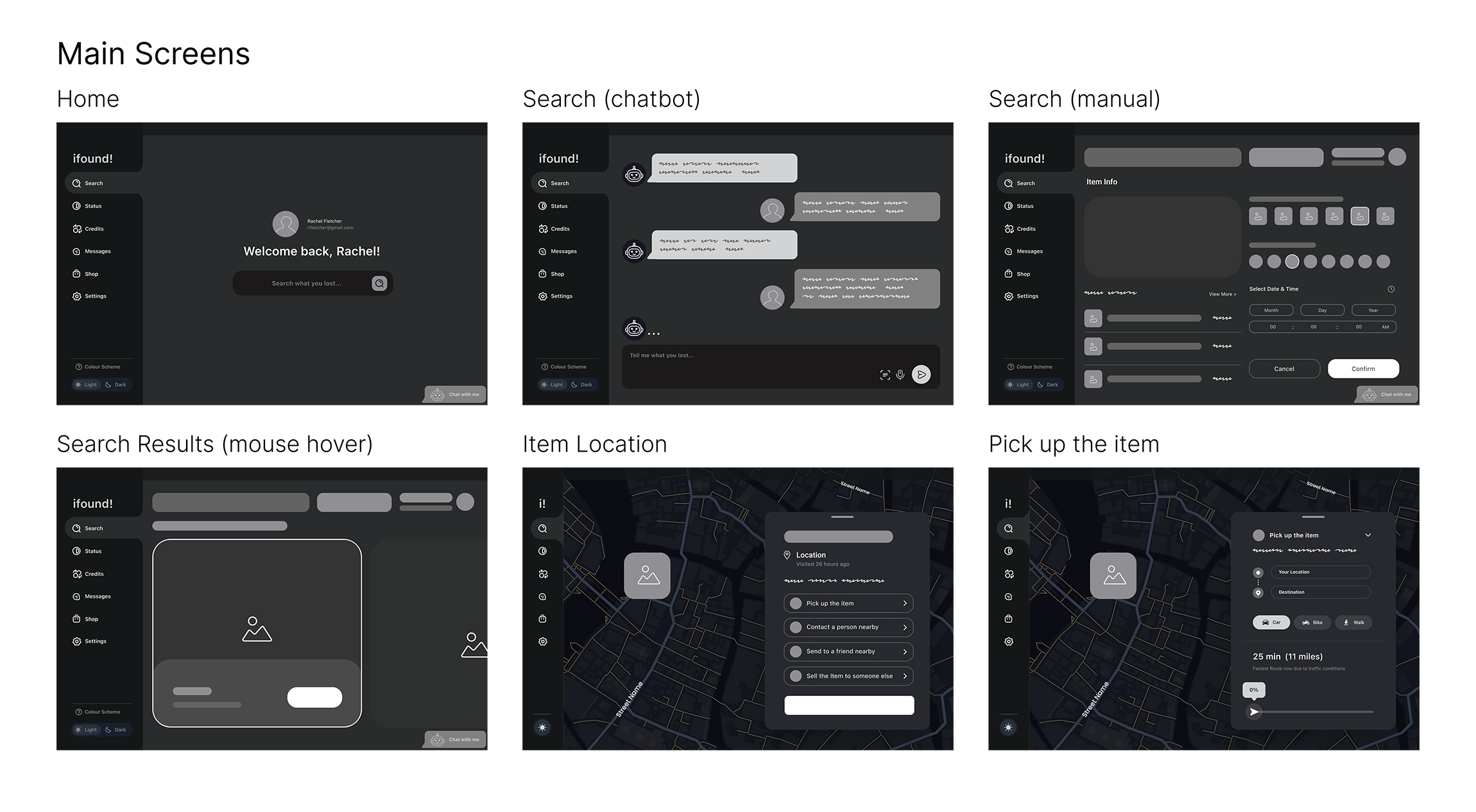
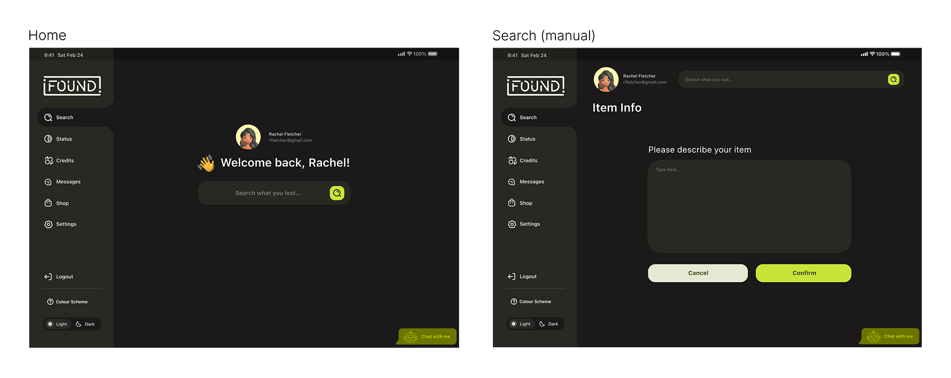
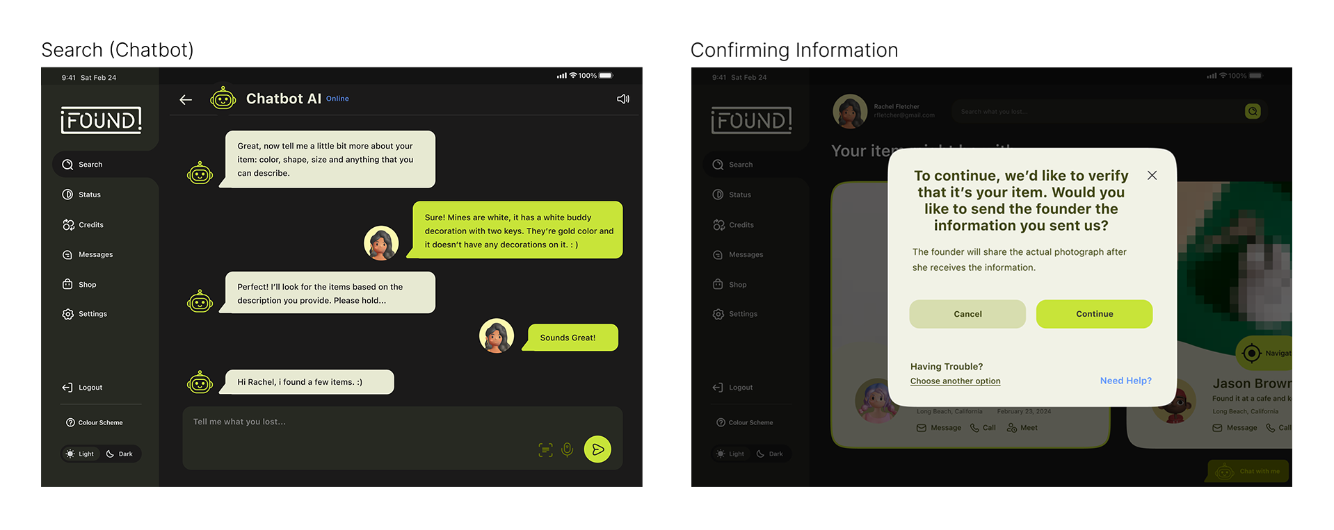
Based on the flowcharts, I transferred the ideas to mid fidelity wireframes. There're six key screens: homepage, search (chatbot & manual), search results, item location, and pick up the item. These pages show the main tasks; how the problems have been solved.

I chose to have minimal look for UI design. It is also friendly and approachable, which will help users feel relived while they're using it.


I applied UI design to the wireframes.


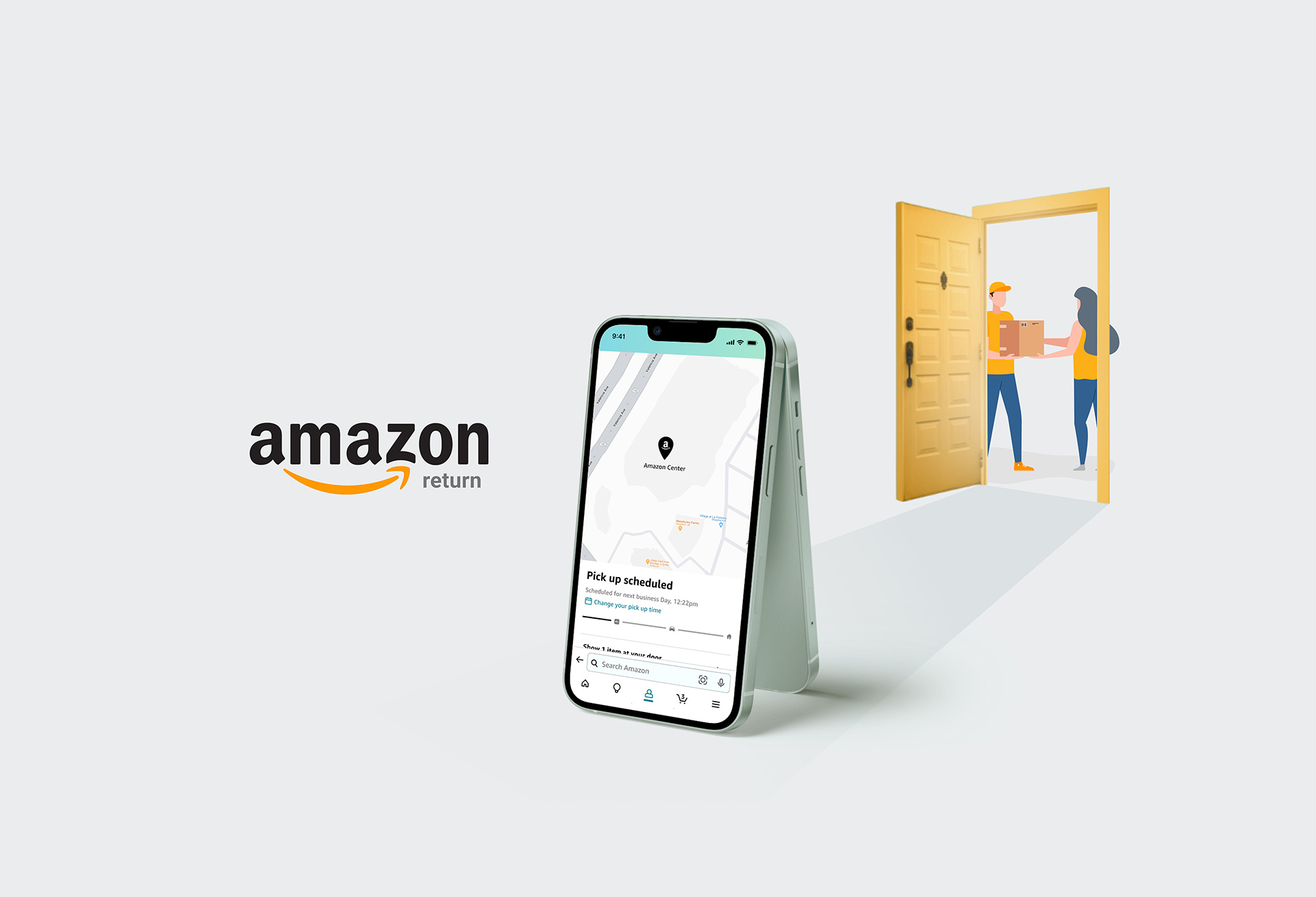
Testers completed three tasks: Task 1: Change Description 2: Share Return (QR) code 3: Amazon Pick-up
9/10 users said, overall it was very easy and straight forward
3/10 testers mentioned that the new icons that's been added looked familiar and went well with the current design
2/10 people mentioned that they first clicked the profile icon on the homepage
There was a suggestion that it would be nice to have the back button at the top. However, it's not following the current navigation that Amazon is using.
Separated the manual search screen for users to focus on one question at a time
Added human interaction level questions to verify a user
Made the radio buttons more prominent to help accessibility purposes, and added green stroke and highlight when selected
Differentiated CTA buttons on the cards where users commented: it seemed like they had the equal importance
Added scheduling feature to "Pick Up the Item" task

After testing the product on 11 participants, I addressed the solutions to improve the design based on users feedbacks.
1. After I realized that the radio buttons were not noticable to users (50% of people said it was not obvious) – I made improvement on them by enlarging the circles and adding a hovering effect. It will also highlight the area when you select the buttons. This practice taught me how UI design can effect to user experience design; when you enhance user interface design, it makes users to experience better product. Thus, they’re correlated and both are important.

2. The second task I made improvement was “Manual Search” By applying users’ feedback from usability testing, I distributed them to different screens. It helps users to focus on one question at a time.

3. I learned that testers considered about having bad users in the app. They were afraid that their items being revealed too soon. To solve this problem, I added screens that included human interaction level questions. This way, users will feel secured and safe when they see their items in the app.

4. Lastly, I created chatting and scheduling procedures between “location of the founder” and “map” screens. It makes users to complete the last task, “pick up the item” easier.